(Insert champagne, balloons, and fireworks.)
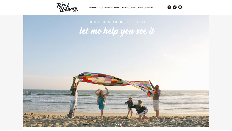
My new website is finally completed! You can view it here.
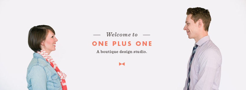
The work was done by the team at One Plus One Design, (link), who I can’t thank enough or recommend more highly. Please check out their work, they are amazing illustrators and print designers as well.
This process took three long years, which was entirely my own fault, and they hung in there with me while I went through a lot of personal growth and indecisiveness. I wasn’t fully prepared to make decisions when I started this process. I knew what I didn’t want, but it was very very difficult for me to figure out what I did want.
When we started, I knew I wanted to change from having something that leaned towards “cutesy” to something more timeless and professional. I wanted my work to speak for itself and become, in it’s own way, the bulk of my “branding”. I didn’t need or want a lot of bells and whistles. I wanted my internet presence to be simple, clean, have bold graphics, and great organization. Most importantly, I wanted it to feel effortless and to be able to stand the test of time without falling into the trap of being trendy. I just wasn’t entirely sure how to get there. Jessie and Tyler at One Plus One were patient and professional with me throughout the entire duration, and I truly, truly put them through the wringer. They helped me figure it out, and the moment I saw my logo I knew it was the one. It’s perfect for me.
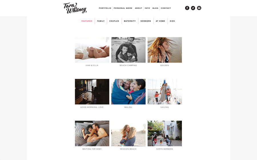
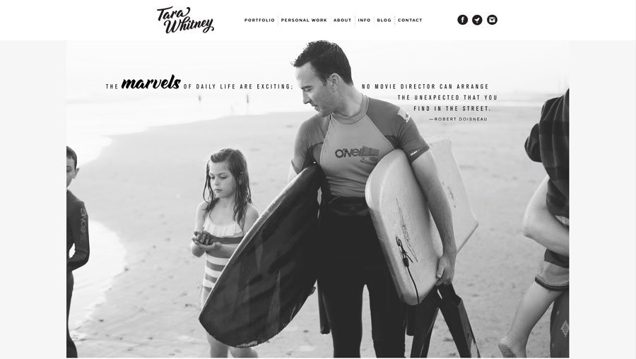
The website design was such a surprise when I first saw the mock ups, and I knew it was perfect. The design is built around several large feature images, with scroll down functionality. Three years ago when One Plus One designed it, not many other sites were built that way, so they were way ahead of the curve. The portfolio includes the typical choices, with the addition of a “featured session” section. I have always felt my work is best seen in story form, and now prospective clients are able to see several sessions in their entirety, which is really great. Not to mention, the thumbnails in that section just look really, really cool.
After all the hard work, heartache, anxiety, stress, talking to friends, changing my mind, getting advice … what this process really boiled down to for me was getting brave and making decisions to put out into the world what *I* wanted to say, what *I* wanted to show. And you know, it was just really scary for me to take the steps to do that. Being brave and confident doesn’t come easily to me, but the deeper I got into what I really wanted, the more I realized it was the way to go.
I really hope you all enjoy it, and I thank all of you for the years of support and inspiration you have given me.
For the last three years, so much of my head space has been taken up by this, and now that it is complete, I look forward to a new energy around here and am invested in connecting more often and sharing more.
With so much gratitude,
Tara
(The site is not yet responsive on smaller screens – but I am working on getting that taken care of – right now it is best viewed on a desktop computer.)


just beautiful Tara! I love it all. congratulations on a spectacular new site and branding. thank you for being brave and sharing your process… I can totally relate! xoxo
It is gorgeous! I love the images and quotes and all the black and white. I’m still saving for a trip to CA and photos by you.
Go you.
It’s just perfection, Tara! You have been my inspiration for ages, and I won a website template from you long ago, which I still use! I just want to say thank you for existing.
Your website is amazing! I remember seeing you ask for designer recommendations way back when and have been anxiously awaiting your reveal ever since. Totally worth the wait.
The new site looks incredible. Worth the wait! :) Congratulations!!!!
It’s totally perfect Tara!!
So happy for you and your gorgeous site! it displays your work perfectly. I have been following you for five years now! I am constantly inspired!
LOVE this new look! Congrats Tara:)
Awesome Tara! I love your work so much! I just wish you lived here in Mexico so we could have photos taken by you! Your new site is neat!
OH. Tara! It is beautiful and well worth the wait! I LOVE, LOVE, LOVE it!!!
it looks great! makes me even more anxious for the day you will take my family’s pictures (one day…) ;)
It is absolutely gorgeous!!! I’m really inspired by it, as a web designer, and also just as a person who likes pretty pictures and who follows you and your writing.
Congratulations, the website is gorgeous.
Super fun to come here after awhile and find your new space. What a big exhale for you. It’s perfect and very you. I love it. :)
Congratulations Tara!!! It’s beautiful!!! <3
it is great! i love the way it makes me want to open up the site and see what is inside ( i hope that does not sound weird!), like an invitation to your work. well done!
Is it strange that I come back and stare at your new site? It reminds me of you so much. Love it. So proud of you! xx
Looks gorgeous, Tara! Your website is one of my favorite spots for a weekday break.